Blog entry by Bob Gilmore
Incoming long post about Windows 8.1 and specifically the touch interface. I originally wrote and posted this on Facebook and have decided to cross post here with another weeks heavy use.
I’ve been using Windows 8.1 for a while now, but primarily on a big desktop and so I’ve not spent much time with Metro or ModernUI or MUI of whatever it’s called. I actually like 8.1 on the desktop with a few exceptions (auto-sorting files in the explorer and no ctrl-click on taskbar tabs springs to mind) but this is not about that.
Since I got the Surface Pro, which is a fantastic piece of kit, I thought I should give MUI a run, get used to it and then write down some thoughts.
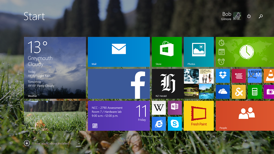
My Start Screen. Social media live tiles disabled to protect the guilty.
Note the new Power and Search Icons top right copied form the right hand charms menu.
I am going to ignore some of the common major complaints here, especially the switch from Modern to Desktop UI's when moving from one app to another. On Touchscreen, it actually feels fine, but on a mouse system, its maddening. Windows 8.1 Update 1 (MS naming conventions at their finest) goes some way to alleviate this by being smarter about which apps to default to.
First up, typing this on the Windows software keyboard, I have to say it’s the best standard software keyboard out there. Having left and right navigation keys and a backspace button make a huge difference over the horrible Android and iOS built in ones and mean I don’t have to pay for a replacement.
The touch enabled experience is pretty solid, but feels immature. In general, the apps look good if they follow the design guides and the live tiles are actually quite nice when they work. Not having software home and menu buttons on the device is a godsend. No more accidental home screen when I meant to hit space in Facebook!
The swipe in from the side gestures are not especially intuitive, but easy enough to learn. The alt-tab swipe from the left is way too easy to do accidentally when scrolling through an app, which are laid out horizontally rather than vertically on the mostly horizontal tablet.
Split screen view is still useful and works well, especially split desktop / app.
ModernUI split screen, showing the Reader app and Internet Explorer.
There are some weird inconsistencies, even within MS’s own apps. For example, swiping from the bottom brings up an apps menu. The menus should therefore be at the bottom to match this and mostly are. However the Windows Store has its menu appear at the top.
The Windows store is pretty empty. It feels like Android did about 2 years ago, which is understandable. I sometimes wonder if I shouldn’t be teaching Windows App development rather than Android; there is a huge potential to make money in the Windows Store right now that possibly doesn’t exist in the other two big stores. My thoughts on developing for Windows probably deserve another blog post all of their own.
Regarding the built in apps, especially the Bing apps, their quality varies wildly. Bing weather is the best weather app I’ve ever used, hands down. Bing Sports has Cricket and Rugby Union, but not League or any National Rugby teams. Bing News is terrible; live tiles that do not work unless you use one of the featured sources, of which there are none for NZ, and RSS feeds to make up for that don’t get remembered.
One thing I have noticed over extensive use is the built in MS apps break regularly. The message "This app can't open. Visit the store for details" is becoming a common place occurrence and the app needs to be repaired before it will work again. Additionally, the live tiles seem to break. As noted above, news doesn't work, but since I originally wrote this, the Sports app live tile is now broken and (almost certainly related) the news feed in that app has stopped working.
SkyOneDrive support built in is good, but the OS can’t decide what to call it yet as it’s often referred to both within the same task flow. I find OneDrive syncing much slower than 8 or 7, unusual considering it is native now, and the feature to open files on the PC from anywhere being dropped out of the native client is disappointing. This was OneDrive’s best feature over the opposition.
OneNote for ModernUI is the stand out hit feature for me. The touch specific version is simply stunning. The team who designed this will go far. Also worth a mention is FreshPaint. A really cool painting app that works so well with the Surface pen I find myself actually using it rather than dabbling and then ignoring it like so many others of these apps in the past. I feel like I could actually create some art with this thing.
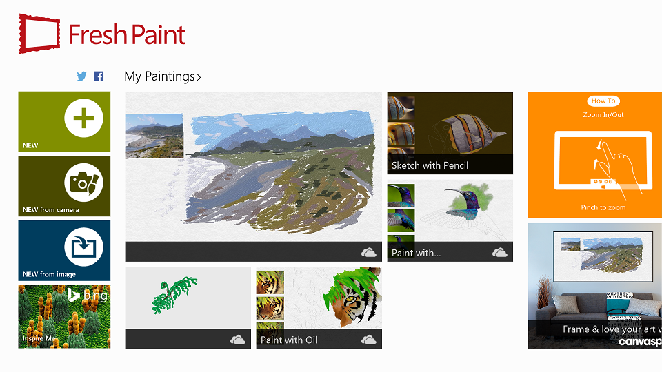
Fresh Paint for Windows 8.1 with one of my masterpieces showing!
There is one huge thing missing from the ModernUI experience whose oversight boggles me; a persistent clock and battery indicator across all the apps in the UI. Swiping in from the right doesn’t cut it because I keep interrupting my task to check the time if I have appointments. On that note, a persistent alert indicator for appointments, messages, etc, wouldn’t go astray either although that I don’t miss quite so much as the alerts on other OS’s do interrupt my workflow more often than not.
Since the Update 1 release, they've put a shutdown and search button on the start screen. I can't figure out why. Sure shutdown was well hidden before, but the logical place would have been to click the user icon already on the start screen and shutdown/restart from there where logout already is. Do we even need a software shutdown anymore? Physical power buttons are there for a reason after all.
So there you go. My thoughts on MetrodenUI. Would be interested to hear other thoughts on it.